Choosing the right paint color can instantly change how your home feels ….. calm or energetic, warm or modern, luxurious or cozy. As we move into 2026, interior designers are shifting away from overly safe neutrals and leaning into thoughtful, mood-driven colors that still feel timeless.
This year’s paint trends focus on warmth, depth and personality, while staying practical for real homes ….rentals, apartments and family spaces included.
If you’re confused about what colors to use (or scared of making a mistake), this guide will walk you through 2026’s most stylish paint colors and exact room-by-room ideas so you can apply them confidently.
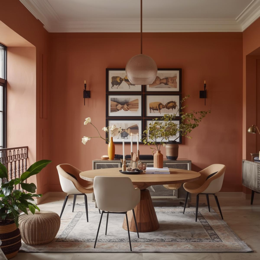
1. Soft Clay & Warm Terracotta Tones
Designers love clay and terracotta tones because they instantly add warmth and character without feeling overpowering. These colours have an earthy softness that makes spaces feel lived-in rather than styled just for photos. In Indian homes, where natural light is often strong, clay shades balance brightness beautifully and prevent rooms from feeling washed out. They’re also incredibly forgiving …. minor furniture changes or decor updates won’t clash with them easily, making them a long-term safe choice.
Best for: Living rooms, dining areas, balconies
In 2026, earthy paint colors are evolving. Instead of loud terracotta, designers prefer soft clay shades …. warm, muted, and slightly dusty.
Why designers love it:
- Adds warmth without feeling dark
- Makes a space feel grounded and welcoming
- Works beautifully with Indian homes and natural light
How to use it:
- Paint one accent wall in clay tone, if your space is small
- Pair with off-white or warm beige on other walls
- Style with wooden or cane furniture, jute rugs and linen curtains
- Avoid pairing clay with cool greys … it kills the warmth
Pro tip: Use Hacienda Clay (7936) on main walls and Rustic Earth-N (9901) as a deeper accent on a feature wall.
2. Deep Olive & Moss Green
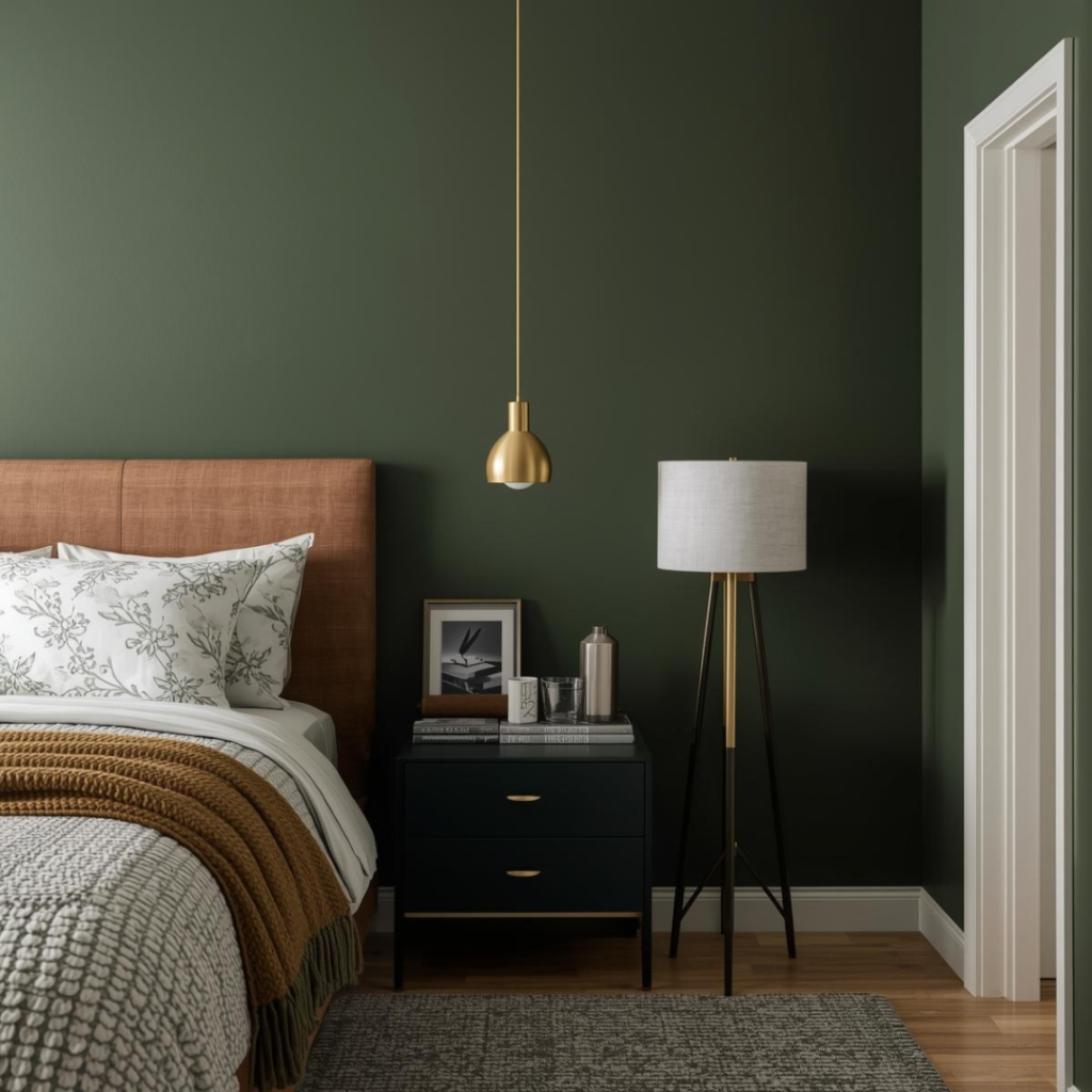
Deep greens are favoured by designers because they create a sense of calm and stability in a home. Unlike trendy bright greens, olive and moss shades feel mature, grounded and timeless. They work especially well in spaces meant for rest or focus, such as bedrooms and studies. These tones also elevate a space instantly, making even simple furniture look more refined and intentional.
Best for: Bedrooms, study rooms, TV unit backdrops
Green continues to dominate, but 2026 is all about moody, earthy greens rather than bright or pastel paint colours.
Why designers love it:
- Creates a calm, nature-inspired atmosphere
- Looks luxurious without being flashy
- Pairs well with gold, brass and wood accents
- Always pair dark green with warm lighting
- Avoid glossy finishes …. matte looks more luxurious
- Ideal for rooms that receive good daylight
Best color combinations:
- Olive green + warm white
- Moss green + beige upholstery
- Deep green + walnut wood furniture
3. Warm Greige (Grey + Beige)
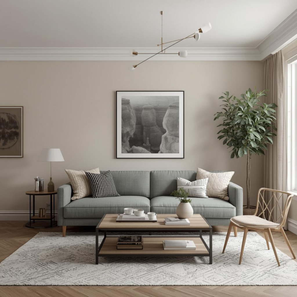
Greige remains a designer staple because it offers the best of both worlds ,the elegance of grey and the warmth of beige. It adapts beautifully to different decor styles, whether modern, minimal or transitional. Designers often recommend greige for clients who want a neutral base that won’t feel dated after a few years. It also works exceptionally well in open-plan homes where continuity between spaces is important.
Best for: Whole house, rental homes, open layouts
Grey isn’t gone …. it’s just warmer now. In 2026, designers prefer greige, a perfect balance between grey and beige.
Why designers love it:
- Neutral but not boring
- Works with both modern and traditional decor
- Extremely safe if you’re unsure about color choices
How to style it:
- Pair with cream curtains and light wood furniture
- Add black or matte bronze accents for contrast
- Layer textures: cushions, rugs, throws
- Test samples in both daylight and night light
- Choose warmer greige for Indian homes
- Works extremely well in open living-dining layouts
4. Muted Blush & Dusty Rose
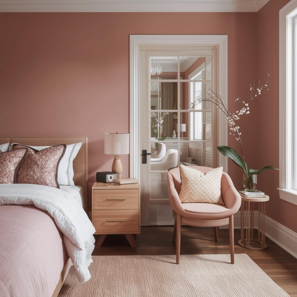
Muted blush tones are loved by designers for the softness they bring into interiors. These shades add warmth without being loud and create a soothing environment that feels personal and comforting. Unlike traditional pinks, dusty rose works well across age groups and doesn’t feel gender-specific. Designers often use it in private spaces to add a subtle layer of elegance without overwhelming the room.
Best for: Bedrooms, vanity corners, dressing rooms
Pink in 2026 is subtle, mature, and elegant ….. nothing loud or childish.
Why designers love it:
- Adds softness and warmth
- Makes bedrooms feel cozy and relaxing
- Looks especially beautiful in low or warm lighting
How to style it:
- Pair with cream curtains and light wood furniture
- Keep furniture neutral to avoid overload
- Avoid pairing with bright whites …. choose creamy tones
- Use textured fabrics to elevate the look
Best combinations:
- Dusty rose + warm grey
- Blush pink + beige
- Pink + brass or gold accents
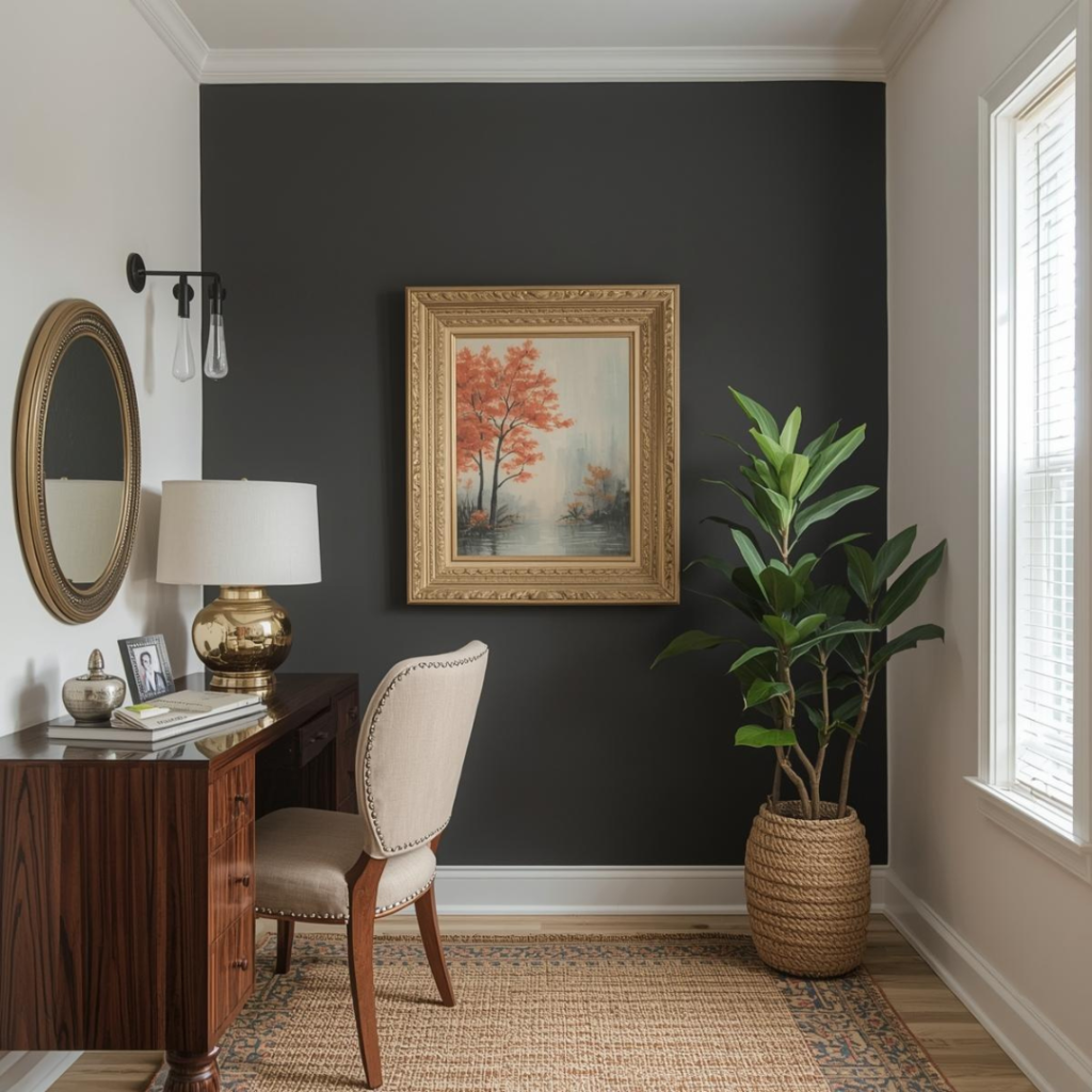
5. Charcoal with Warm Undertones
Charcoal is a powerful design tool when used thoughtfully. Designers rely on warm-toned charcoals to create contrast and drama while still maintaining visual comfort. These shades make a space feel bold and modern, especially when used as a backdrop for art, lighting or statement furniture. The key lies in restraint … charcoal is meant to highlight, not dominate.
Best for: Home offices, powder rooms, accent walls
Dark colors are trending again … but only when used smartly.
Why designers love it:
- Adds drama and sophistication
- Makes spaces feel intentional and bold
- Works beautifully with modern interiors
How to use it safely:
- Pair with light flooring and warm lighting
- Add mirrors to prevent the space from feeling closed
- Never paint all walls charcoal in small rooms
- Best used in powder rooms, home offices or feature walls
6. Soft Butter Yellow & Creamy Yellows
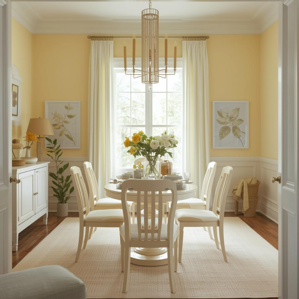
Soft yellows are making a comeback because they bring positivity and warmth into homes without being overpowering. Designers use these shades to brighten dull spaces and create a welcoming atmosphere, especially in homes with limited sunlight. Unlike bold yellows, buttery tones feel calm and comforting, making them suitable for everyday living spaces.
Best for: Kitchens, breakfast corners, entryways
Yellow is making a quiet comeback …. not bright, but creamy and comforting.
Why designers love it:
- Instantly brightens spaces
- Makes rooms feel happy and welcoming
- Perfect for homes with limited natural light
Best combinations:
- Butter yellow + white cabinetry
- Creamy yellow + light wood
- Yellow accents with neutral walls
Pro tip: These are especially great in kitchens and breakfast nooks.Avoid bright lemon yellows.
use satin or eggshell finish for easy maintenance.
7. Off-White with Character
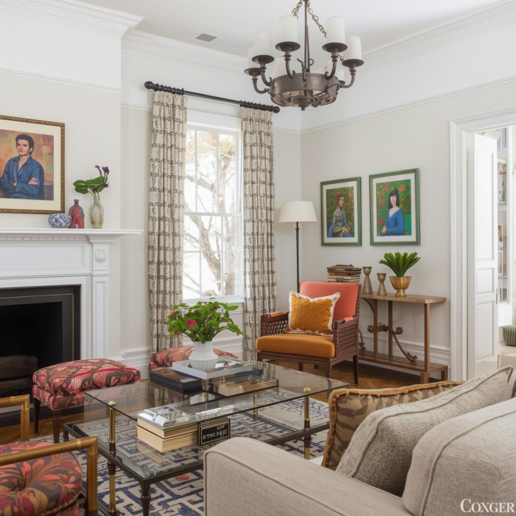
Designers rarely rely on plain white because it can feel flat and clinical. Off-whites with subtle undertones add depth while keeping the space light and airy. These shades are perfect as a base color because they allow furniture, artwork and decor to stand out. They’re also extremely versatile, making them ideal for rentals, resale homes and long-term living.
Best for: Entire home, minimalist interiors
Plain white is out. In 2026, designers use off-whites with subtle undertones ….warm, creamy or slightly grey.
Why designers love it:
- Feels clean but not sterile
- Makes homes look expensive and airy
- Ideal for showcasing decor and furniture
How to choose the right off-white:
- For warm homes → creamy white
- For modern homes → soft grey-white
- For low light spaces → warm ivory
Pro tip: These off-whites are perfect as base colours for entire homes , neutral enough yet richer than plain white. Choose undertone based on your lighting.
Final Designer Advice for 2026
Always test paint samples on your actual walls
One of the biggest mistakes homeowners make is choosing a paint colors based only on a catalog, phone screen or store lighting. Paint behaves very differently once it’s on your wall. Natural light, tube lights, warm bulbs and even nearby furniture can completely change how a shade looks. What appears soft and warm in the store can look dull or too dark at home.
Designer rule: Always test at least 2–3 shades on a small wall section and observe them at different times of the day before finalising.
Choose warm undertones for homes
Most homes receive strong sunlight or warm artificial lighting, which makes cool-toned paints (bluish greys, icy whites) look harsh or flat over time. That’s why designers strongly recommend warm undertones….beige-based neutrals, earthy colors, creamy off-whites and muted greens. These shades age better, feel more inviting and suit materials like wood, marble and brass.
Designer rule: If you’re confused, always choose the warmer option between two similar shades.
Use darker colors strategically
Dark and bold colors are trending in 2026, but designers never use them everywhere. Instead, they’re applied with intention….as feature walls, backdrops for beds or TV units or in smaller spaces like powder rooms and studies. This adds depth and character without making the home feel smaller or heavy.
Designer rule: One dark wall creates impact….. four dark walls create stress (especially in compact apartments).
Lighting is as important as paint
Even the best paint color can fail under poor lighting. Designers always plan paint and lighting together. Warm lights enhance earthy tones, blush shades, and off-whites, while cool lights can wash out warm colors and make spaces feel clinical. Floor lamps, wall lights and cove lighting can completely elevate how your paint color looks.
Designer rule: If your room looks “off” after painting, fix the lighting before blaming the color.